Full Screen Images To display full screen images, the SlideshowLightbox component is used, but its fullScreen prop is set to true.
Demo Import Firstly, import the components required:
import { SlideshowLightbox } from 'lightbox.js-react' Usage Next, wrap the images you wish to include in the slideshow gallery within a SlideshowLightbox component as shown below:
< SlideshowLightbox fullScreen = { true } className = ' container grid grid-cols-3 gap-2 mx-auto ' >
< img className = ' w-full rounded ' src = ' https://images.pexels.com/photos/580151/pexels-photo-580151.jpeg?auto=compress&cs=tinysrgb&w=1260&h=750&dpr=2 ' />
< img className = ' w-full rounded ' src = ' https://images.pexels.com/photos/13996896/pexels-photo-13996896.jpeg?auto=compress&cs=tinysrgb&w=1260&h=750&dpr=2 ' />
< img className = ' w-full rounded ' src = ' https://images.pexels.com/photos/13208323/pexels-photo-13208323.jpeg?auto=compress&cs=tinysrgb&w=1260&h=750&dpr=2 ' />
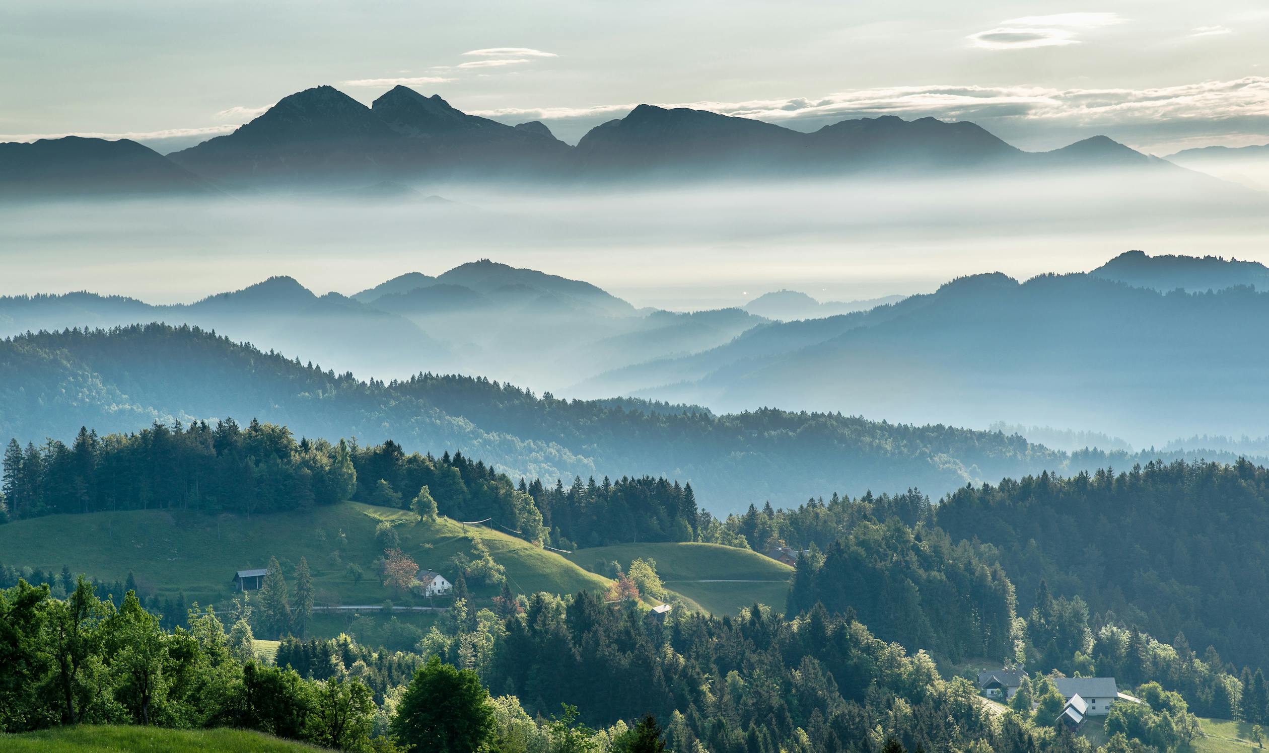
</ SlideshowLightbox > This will display an image gallery as shown below:
Full example import React , { Component } from 'react'
import { SlideshowLightbox } from 'lightbox.js-react'
class Demo extends Component {
render ( ) {
return < SlideshowLightbox fullScreen = { true } className = ' container grid grid-cols-3 gap-2 mx-auto ' showThumbnails = { true } >
< img className = ' w-full rounded ' src = ' https://images.pexels.com/photos/580151/pexels-photo-580151.jpeg?auto=compress&cs=tinysrgb&w=1260&h=750&dpr=2 ' />
< img className = ' w-full rounded ' src = ' https://images.pexels.com/photos/13996896/pexels-photo-13996896.jpeg?auto=compress&cs=tinysrgb&w=1260&h=750&dpr=2 ' />
< img className = ' w-full rounded ' src = ' https://images.pexels.com/photos/13208323/pexels-photo-13208323.jpeg?auto=compress&cs=tinysrgb&w=1260&h=750&dpr=2 ' />
</ SlideshowLightbox >
}
} Full example using functional components Here's an example using functional components and Tailwind CSS to style the images, so that they appear in a grid format. However external CSS can be used for this, or styling with the style object on the image gallery container.
import React from 'react'
import { SlideshowLightbox } from 'lightbox.js-react'
function Demo ( ) {
return (
< SlideshowLightbox fullScreen = { true } className = ' container grid grid-cols-3 gap-2 mx-auto ' showThumbnails = { true } >
< img className = ' w-full rounded ' src = ' https://images.pexels.com/photos/580151/pexels-photo-580151.jpeg?auto=compress&cs=tinysrgb&w=1260&h=750&dpr=2 ' />
< img className = ' w-full rounded ' src = ' https://images.pexels.com/photos/13996896/pexels-photo-13996896.jpeg?auto=compress&cs=tinysrgb&w=1260&h=750&dpr=2 ' />
< img className = ' w-full rounded ' src = ' https://images.pexels.com/photos/13208323/pexels-photo-13208323.jpeg?auto=compress&cs=tinysrgb&w=1260&h=750&dpr=2 ' />
</ SlideshowLightbox >
)
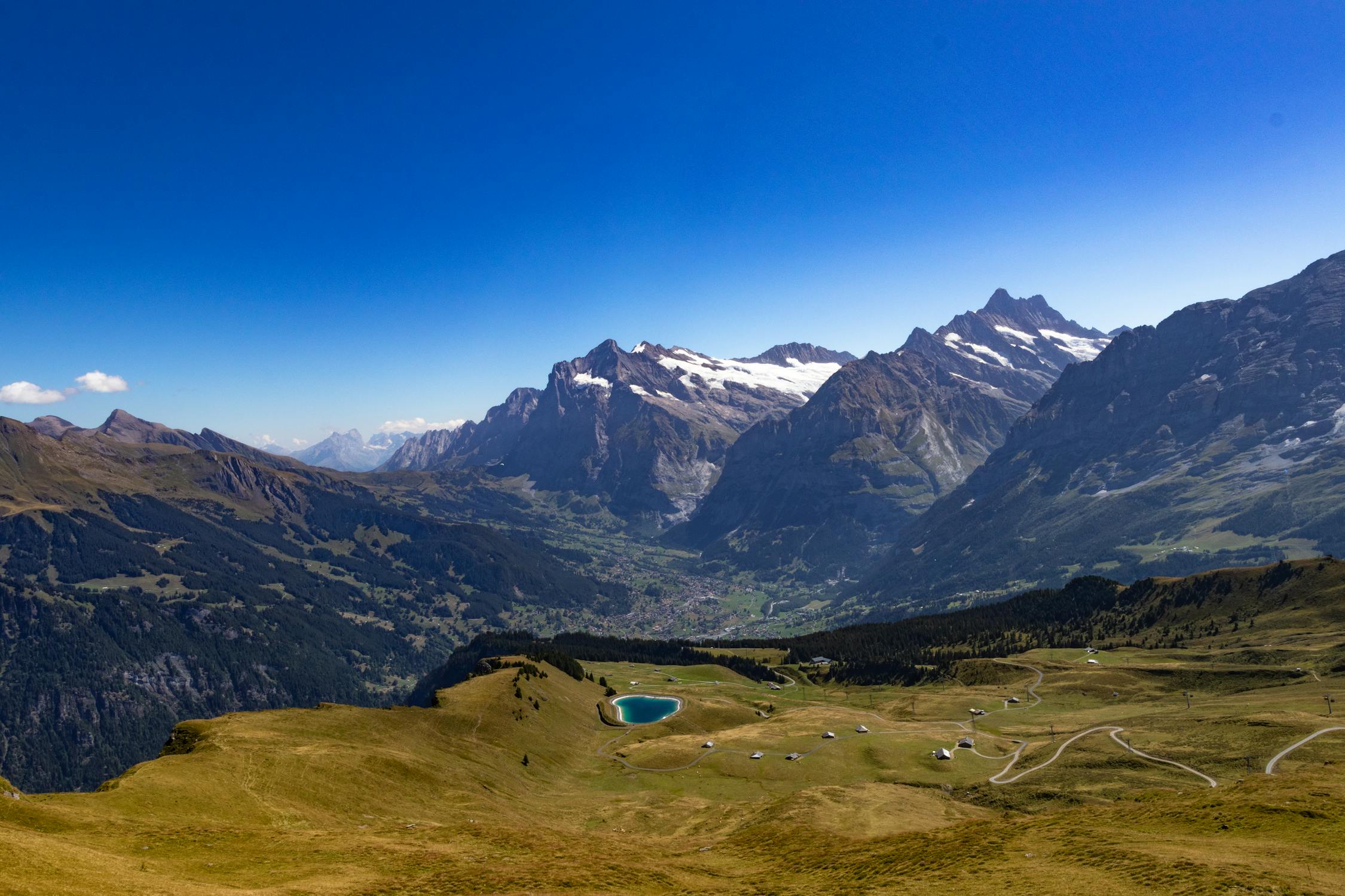
} This will display the following image gallery, along with a lightbox that will appear after one of the images are clicked:
Check out the Image component to display a single image.
Customization Theme If you'd like to change the theme of the lightbox, this can be done by passing a theme name to the theme prop, with the options including: "lightbox", "night", "day"
< SlideshowLightbox theme = " lightbox " >
...
</ SlideshowLightbox > Full Screen Images If you'd like the images to take up the screen's full available width and height, simply set thefullScreen prop to true. The default is false.
< SlideshowLightbox fullScreen = { true } >
...
</ SlideshowLightbox > Background Color If you'd like to customize the background color of the lightbox, this can be done by passing a color to the color prop, as a RGB, RGBA, HEX or CSS color name value:
< SlideshowLightbox backgroundColor = " white " >
...
</ SlideshowLightbox > Icon Color The icon colors can also be specified through the `iconColor` prop, and the color can be a RGB, RGBA, HEX or CSS color name value.
< SlideshowLightbox iconColor = " silver " >
...
</ SlideshowLightbox > Thumbnail border Each thumbnail contains a border which can be customized or removed entirely (by setting the border color to transparent). The border can be customized through specifying a color value for the `thumbnailBorder` prop, and the color can be a RGB, RGBA, HEX or CSS color name value.
< SlideshowLightbox thumbnailBorder = " silver " >
...
</ SlideshowLightbox > Show Thumbnails If you would like to remove thumbnails entirely from the lightbox, you can do so by setting the `showThumbnails` prop to `false`.
< SlideshowLightbox showThumbnails = " false " >
...
</ SlideshowLightbox > Image Animation The animation type can be specified through the `imgAnimation` prop, and the two values include:
< SlideshowLightbox imgAnimation = " fade " >
...
</ SlideshowLightbox > Slideshow Interval When the slideshow is playing, the amount of time between slideshow transitions can be specified through the `slideshowInterval` prop in milliseconds .
< SlideshowLightbox slideshowInterval = { 1600 } >
...
</ SlideshowLightbox > Animate Thumbnails By default, the thumbnails are animated in and out of the DOM using a fade-in effect. If you would prefer to switch this animation off, this can be done so by setting the `animateThumbnails` prop to `false`.
< SlideshowLightbox animateThumbnails = { false } >
...
</ SlideshowLightbox > Props theme : String - The theme to be applied to the lightbox. Options include day, night, lightbox
fullScreen : Boolean - Whether to display images so that they take up tne screen's full width and height
backgroundColor : String - the background color of the lightbox, as a CSS color name, RGBA value or HEX code
iconColor : String - the icon color for the lightbox, as a CSS color name, RGBA value or HEX code
thumbnailBorder : String - the color of the thumbnails' borders, as a CSS color name, RGBA value or HEX code
showThumbnails : Boolean - Whether or not to show image thumbnails.
slideshowInterval : Number - the time in milliseconds before the slideshow transitions to the next image.
animateThumbnails : Boolean - Whether or not to animate the thumbnails as they enter the view.
imgAnimation : String - The image animation type to show between image transitions in the slideshow, options include "fade" and "imgDrag"